INSPIRATION | SIMON STÅLENHAG

Shortly before beginning my greyscale thumbnail designs, I discovered the Swedish digital and concept artist Simon Stålenhag. Whilst I had seen occasional pieces of his during my many voyages through the internet, this was the first time I actually discovered his work in earnest.

“It’s Full of Stars”

I was instantly drawn to his unique style of inserting unusual, sci-fi inspired structures, robots and sometimes even creatures into hyper-realistically rendered countryside scenes, with ordinary civilians often featured interacting with them (or just going about their life in the background).

Whilst I generally prefer more a more stylised approach in concept art, there is something highly alluring about his realistic approach, both in style and in the subject matter – you will find no explosions or extravagant battle scenes in his work – as you can really imagine these scenes actually happening as they’re in a world truly like our own.

A particularly good example of his sci-fi minimalist style

This minimalist way of dealing with the often very visually intense genre of sci-fi was really inspiring to me, and directly fed into several of the thumbnails I made, and I daresay his work will continue to influence me during this module and beyond.


NARRATIVE | FINAL VERSION | FLOW CHART

As WordPress is a complete numpty and won’t allow .swf files to be uploaded here, I have had to instead include a link to it on dropbox where you can download it for your viewing (and hopefully) pleasure.

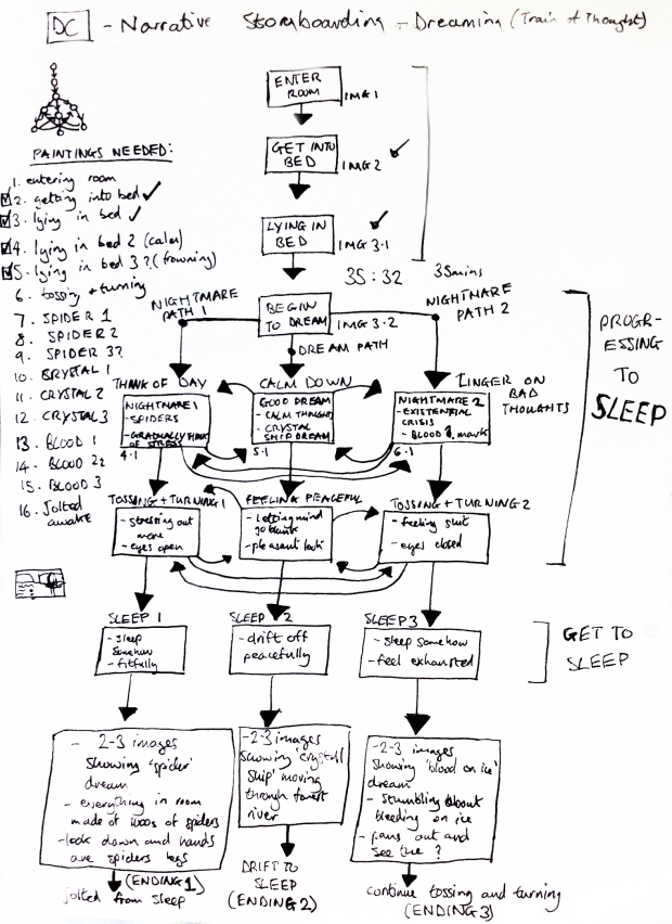
In absence of a nice built-in way to ‘play’ the narrative here, I have included instead a flow chart to get you in the mood, featuring the same images that appear in the narrative as well as indications of where the paths lead in true flow chat fashion. Don’t say I’m not good to you.

DC Narrative Final - FlowChart

NARRATIVE | TRAIN-TRACK ARROW

For this project, it struck me that the narrative paths act in the context of the story very much like a train of thought, so I decided to name the narrative…Train of Thought. I know, imaginative, but hey, it works.

So to keep with the whole locomotive theme I thought I’d design the arrows that you click on to navigate through the narrative to appear like train tracks…as well as you know, still looking like arrows.

Arrow Symbol White

I also designed a version of it with a slight glow around it to act as the button click/mouse-over form, so that when you hover your mouse over the icon, it ‘lights up’ to let you know that it is indeed there for a reason and not just to look nifty.

NARRATIVE | SLEEPING PAINTINGS

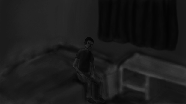
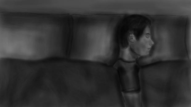
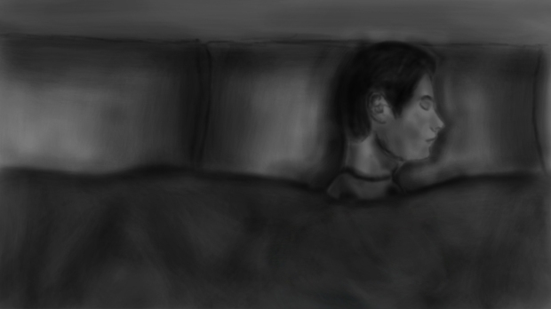
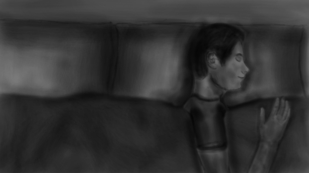
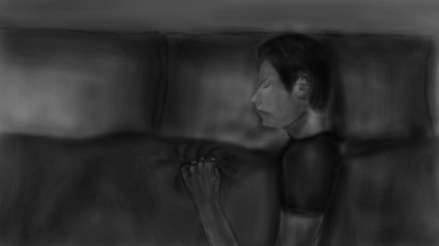
A series of the various sleeping/getting ready for bed/in bed digital paintings I created for the flash narrative.

The expression on my face/body language reflects which path the user is currently on, eg. the frowning, tense faces indicate the ‘nightmare’ route(s), whilst the calm, happy expressions show they’re on the ‘dream’ path.

The black and white colour scheme was chosen to contrast with the more dramatic colours and imagery of the dream/nightmare sequences.

Sitting on bed

Sitting on bed

Lying, neutral expression

Lying, neutral expression

Lying, neutral expression (arm tucked-in)

Lying, neutral expression (arm tucked-in)

Lying, happy expression

Lying, happy expression

Lying, tense expression

Lying, tense expression

Sitting up in bed, 'jolted awake' / restless

Sitting up in bed, ‘jolted awake’ / restless

SEMESTER 2 | TERM PROJECT

So, this semester for Dynamic Communications we had to make a 2D ‘narrative’ on Adobe Flash that tells an interactive story through a series of images and other elements. It was stressed early on that the more personal a story you tell, the better, so I decided to go for a topic that is very much that to me – sleep. I’ve always struggled to sleep and been prone to some pretty horrific nightmares (but conversely, also some very vivid and spectacular dreams).

My narrative idea was thus: to follow the story of myself (addressed in 2nd person) trying to get to sleep. The choices in this narrative are whether to reflect back on your day or to try clearing your mind, with the former gradually leading to a horrible nightmare and the former a pleasant dream (the lose/win outcomes respectively).

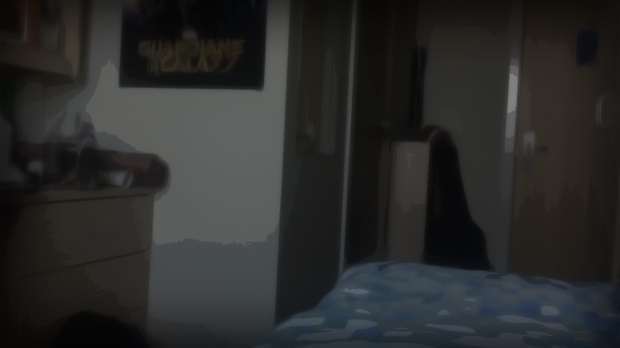
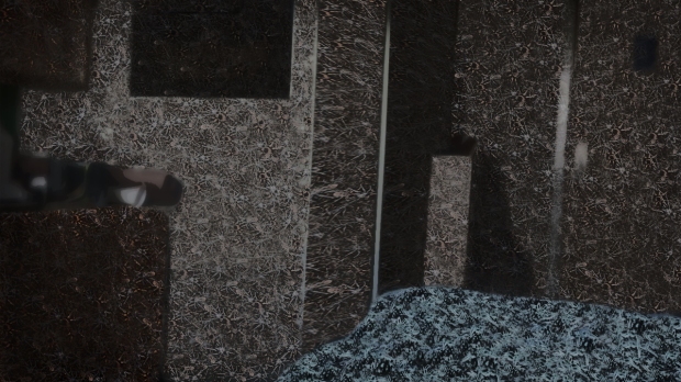
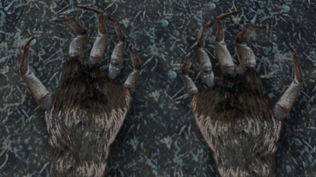
Dreams/nightmares are a good place for visual inspiration I find, and the chosen ones for the narrative are two of my favourite (or memorable, in the case of the nightmare). The nightmare involves one of my greatest phobias – spiders. In it, I awake in my room and it appears normal at first, before every object in the room shifts to being composed entirely out of thousands of hard-packed spiders. As if that weren’t creepy enough, I then look down at my hands and see that they’re like a spider – with spider legs instead of fingers and a horrible hairy palm like a tarantula.

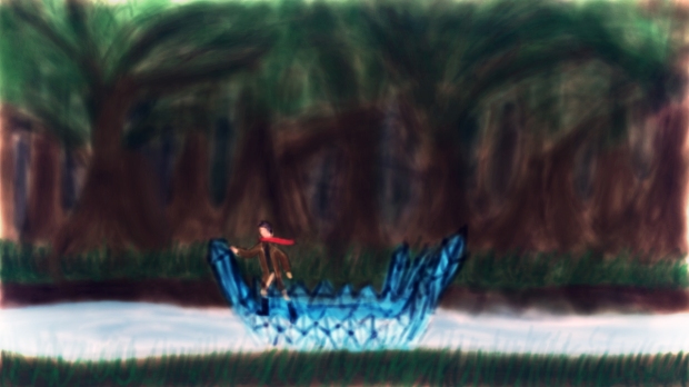
The dream, on the other hand, is wonderfully pleasant and came to me as I was listening to a lot of The Doors, in particular the song ‘Crystal Ship’. I must’ve been having a very literal subconscious that night as I dreamt of, quite literally, a crystal ship; travelling down a shimmering river in the heart of a lush forest. Visually, it’s incredibly peaceful and served as a stark contrast to the ghastly imagery of the nightmare.

NARRATIVE | DREAM PAINTINGS

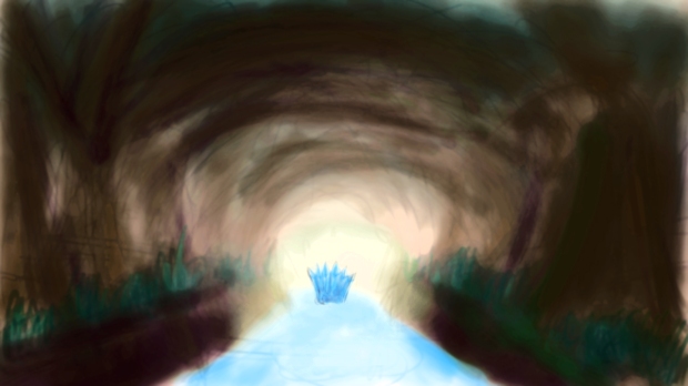
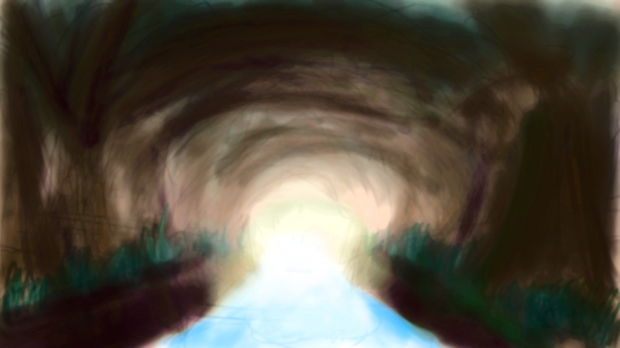
This is all the digital paintings/images I created for the dream/nightmare sequences in the narrative – the ‘crystal ship’ and the ‘spider room’.

The Crystal Ship ones were created purely from scratch in photoshop using digital painting techniques and editing, whilst the Spider Room images were made from photobashing many pictures of spiders along with my room. Also, an image of my own hands was used as a guide for the final ‘tarantula hands’ image, and also used photobashed spiders’ legs and bodies to form the hands, over a background of spiders covering/forming my duvet.

Overall, I’m fairly happy with how they turned out, especially the ‘tarantula hands’ one – it appears especially creepy (though I may be biased as I truly do despise spiders), whilst the Crystal Ship paintings I feel evoke a suitably tranquil and fantastical feeling.

Room, before revealing spiders

Room, before revealing spiders

Room composed of thousands of spiders

The room composed of thousands of spiders

TARANTULA HANDS, AW HELL NAW

TARANTULA HANDS, AW HELL NAW

Crystal ship, travelling down the river

Crystal ship, travelling down the river

Heading towards the light at the end of the 'tunnel'

Heading towards the light at the end of the ‘tunnel’

Fading out of view...

Fading out of view…

...aaaaaand it's gone.

…aaaaaand it’s gone.

KICKSTARTER | THE FINAL PAGE

Here is the final completed image I submitted for the Kickstarter page, showing all the various elements I created laid out into the standard Kickstarter format.

The final layout of the Kickstart page for Mortal Engines

The final layout of the Kickstarter page for Mortal Engines

Overall I’m pretty happy with the final result, however I do wish that I’d included more images as part of the page – as the only real image of the actual project is in the game screenshot at the top of the page. Though some may say that there’s too much text (and that’s certainly true in relation to the number of images) I am pleased that there is a sizeable amount of information on the game itself; on the product, as I believe it shows that I’ve thought a lot about the project itself and not just the graphics.

I’ve really enjoyed this project as a whole. Logo design is something that I’ve always enjoyed doing, whether it was for my Youtube channel or for other people, and I’ve had a lot of fun getting to do it in a more meaningful way by gearing an entire project around visual consistency and branding, as well as designing typography – something entirely new to me.

KICKSTARTER | BUSINESS CARD

Front of the business card, showing the main details

Front of the business card, showing the main details

For the business card, I kept the aesthetic professional but also consistent with both the Kickstarter page and overall project – using my personal logo as that of the company, the main rust texture as the faded background, and the type and colours consistent with the style of that in the stretch goals and rewards.

The back of the business card was kept very simple, featuring just the main logo in the centre without any text for a more minimal, professional look.

Back of the business card

Back of the business card